Histogram: Difference between revisions
Chris.Hansen (talk | contribs) (Created page with "The histogram visualization calculates the distribution of values and presents them as a barchart. The Y-axis and the height of each bar represent the count of values that fall into each bracket while the X-axis represents the value range. center|frameless|700x700px == Supported data formats == Histogram visualization supports time series and any table results with one or more numerical fields. == Display options == Use the following op...") |
Chris.Hansen (talk | contribs) No edit summary |
||
| Line 66: | Line 66: | ||
Choose a standard calculations to show in the legend. You can select more than one. | Choose a standard calculations to show in the legend. You can select more than one. | ||
[[Category:Visualize]] | [[Category:Visualize]] | ||
[[Category:Visualizations]] | |||
Latest revision as of 22:52, 2 January 2024
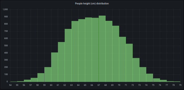
The histogram visualization calculates the distribution of values and presents them as a barchart. The Y-axis and the height of each bar represent the count of values that fall into each bracket while the X-axis represents the value range.

Supported data formats
Histogram visualization supports time series and any table results with one or more numerical fields.
Display options
Use the following options to refine your visualization.
Bucket size
The size of the buckets. Leave this empty for automatic bucket sizing (~10% of the full range).
Bucket offset
If the first bucket should not start at zero. A non-zero offset has the effect of shifting the aggregation window. For example, 5-sized buckets that are 0-5, 5-10, 10-15 with a default 0 offset would become 2-7, 7-12, 12-17 with an offset of 2; offsets of 0, 5, or 10, in this case, would effectively do nothing. Typically, this option would be used with an explicitly defined bucket size rather than automatic. For this setting to affect, the offset amount should be greater than 0 and less than the bucket size; values outside this range will have the same effect as values within this range.
Combine series
This will merge all series and fields into a combined histogram.
Linewidth
Controls line width of the bars.
Fillopacity
Controls the fill opacity bars.
Gradient mode
Set the mode of the gradient fill. Fill gradient is based on the line color. To change the color, use the standard color scheme field option.
Gradient display is influenced by the Fill opacity setting.
None
No gradient fill. This is the default setting.
Opacity
Transparency of the gradient is calculated based on the values on the Y-axis. The opacity of the fill is increasing with the values on the Y-axis.
Hue
Gradient color is generated based on the hue of the line color.
Tooltip mode
When you hover your cursor over the visualization, FojiSoft can display tooltips. Choose how tooltips behave.
- Single - The hover tooltip shows only a single series, the one that you are hovering over on the visualization.
- All - The hover tooltip shows all series in the visualization. FojiSoft highlights the series that you are hovering over in bold in the series list in the tooltip.
- Hidden - Do not display the tooltip when you interact with the visualization.
Use an override to hide individual series from the tooltip.
Legend mode
Use these settings to define how the legend appears in your visualization.
- List - Displays the legend as a list. This is a default display mode of the legend.
- Table - Displays the legend as a table.
- Hidden - Hides the legend.
Legend placement
Choose where to display the legend.
- Bottom - Below the graph.
- Right - To the right of the graph.
Legend values
Choose which of the standard calculations to show in the legend. You can have more than one.
Legend calculations
Choose a standard calculations to show in the legend. You can select more than one.